Apple Music
A redesign of playlist management in Apple Music: I audited the existing screens, listed what slows users down, and proposed five focused fixes.
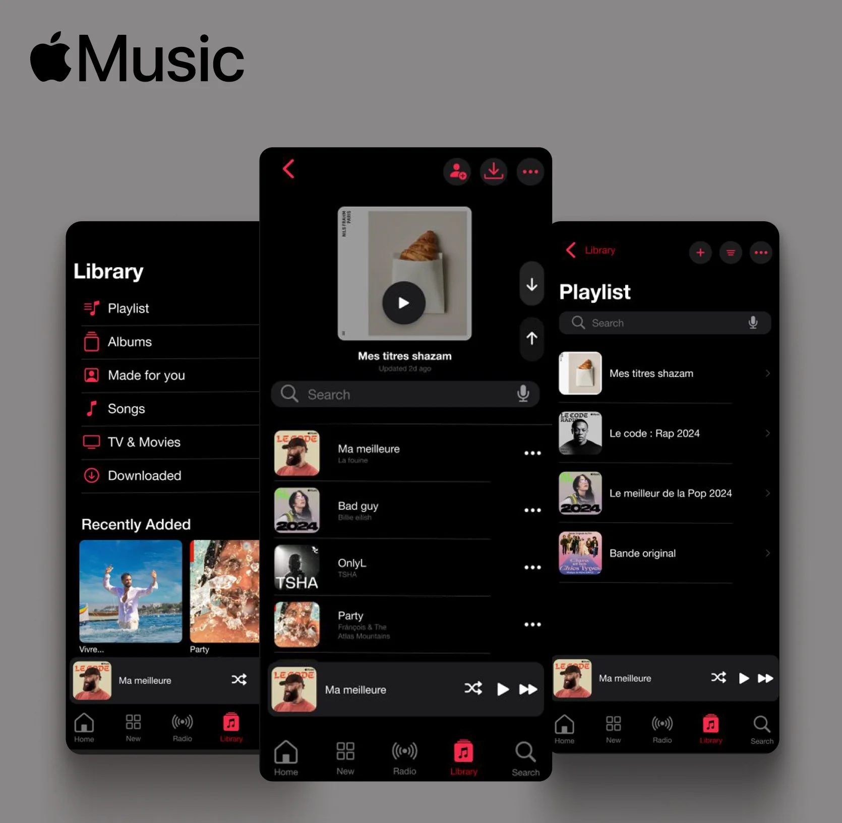
Apple Music has a sleek interface and a huge library, but its experience is not always optimal — especially for playlist management. Users spend a lot of time navigating their playlists, so that is where I focused.
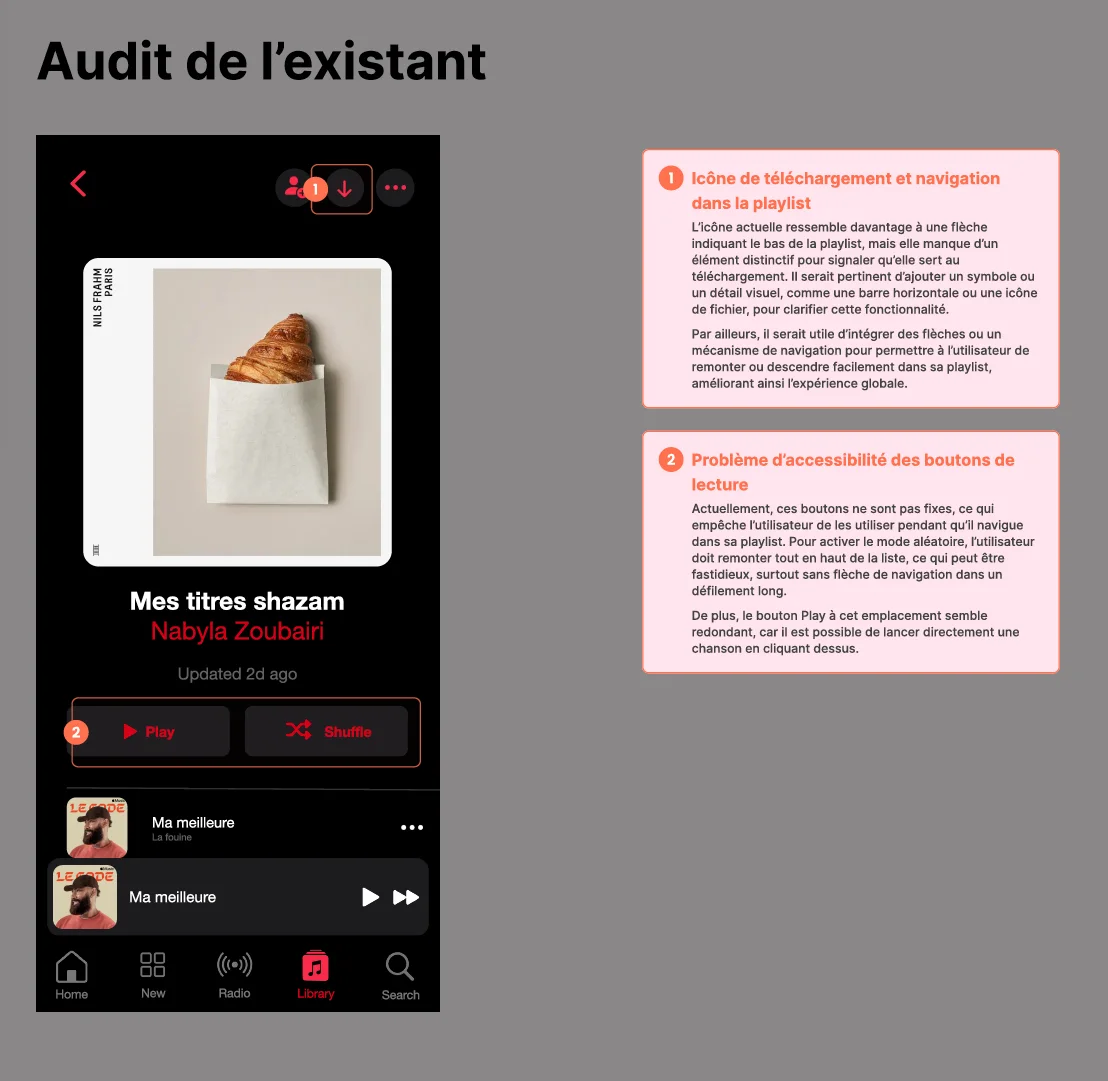
I started with an audit of the existing playlist screen and annotated each friction point: an unclear download icon, navigation that's hard to find, and play / shuffle buttons that aren't accessible enough.
Instead of redesigning everything, I kept Apple's visual language and changed only what the audit pointed to:
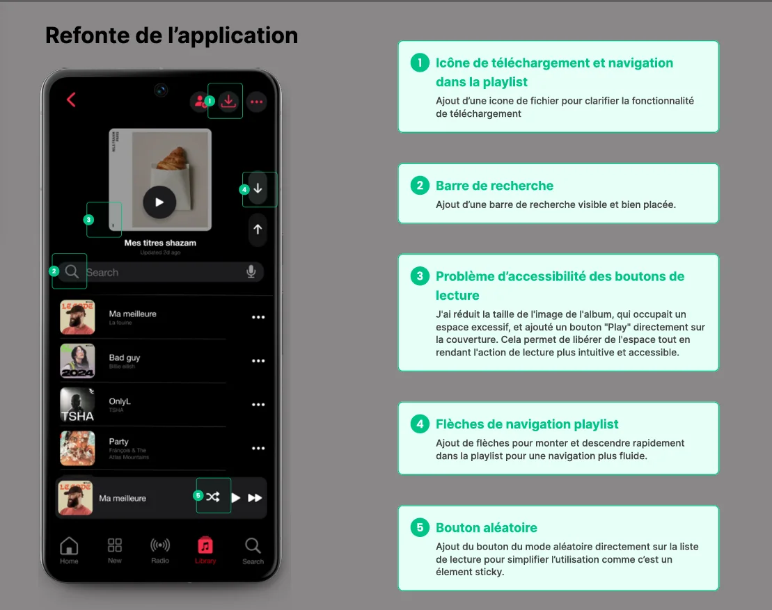
Stay inside Apple's design language: the fixes should feel like a natural update of the app, not a different product.
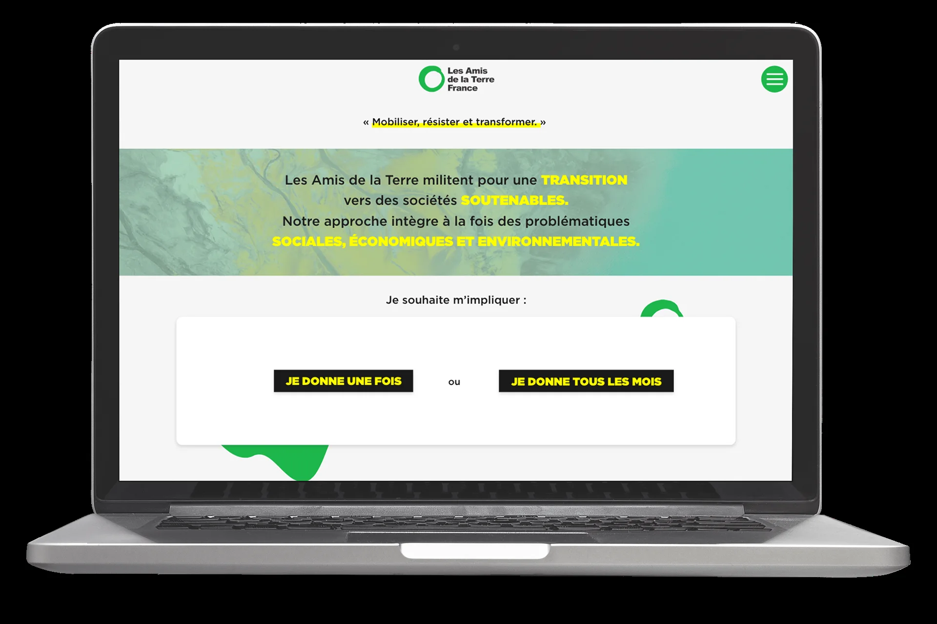
Les Amis de la Terre
A faster, clearer donation journey →